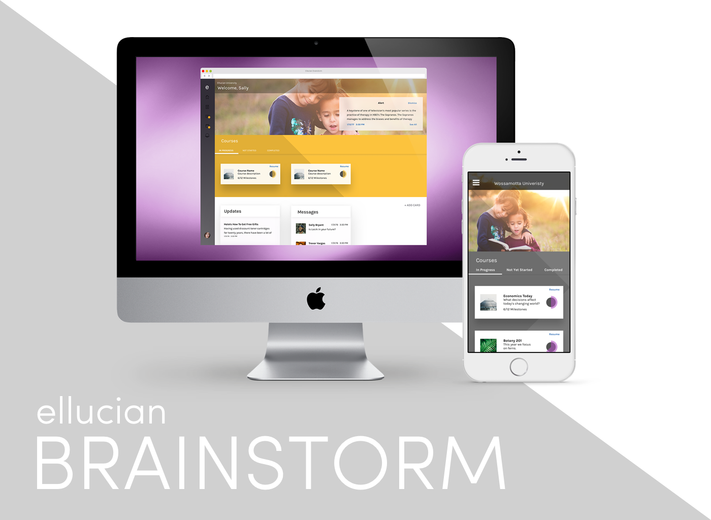
Ellucian Brainstorm was a first-of-its-kind competency-based education (CBE) solution designed for higher education, offering a personalized “made for me” experience for students. With Ellucian Brainstorm, educators seeking an effective competency-based education model could finally meet modern students where they were and give credit for what they already knew.
To fully help the modern student, Brainstorm needed to adapt to current trends by becoming mobile-minded. Through effective research and empathy, I was able to adapt the product’s existing functionality to more fully match the user’s needs.
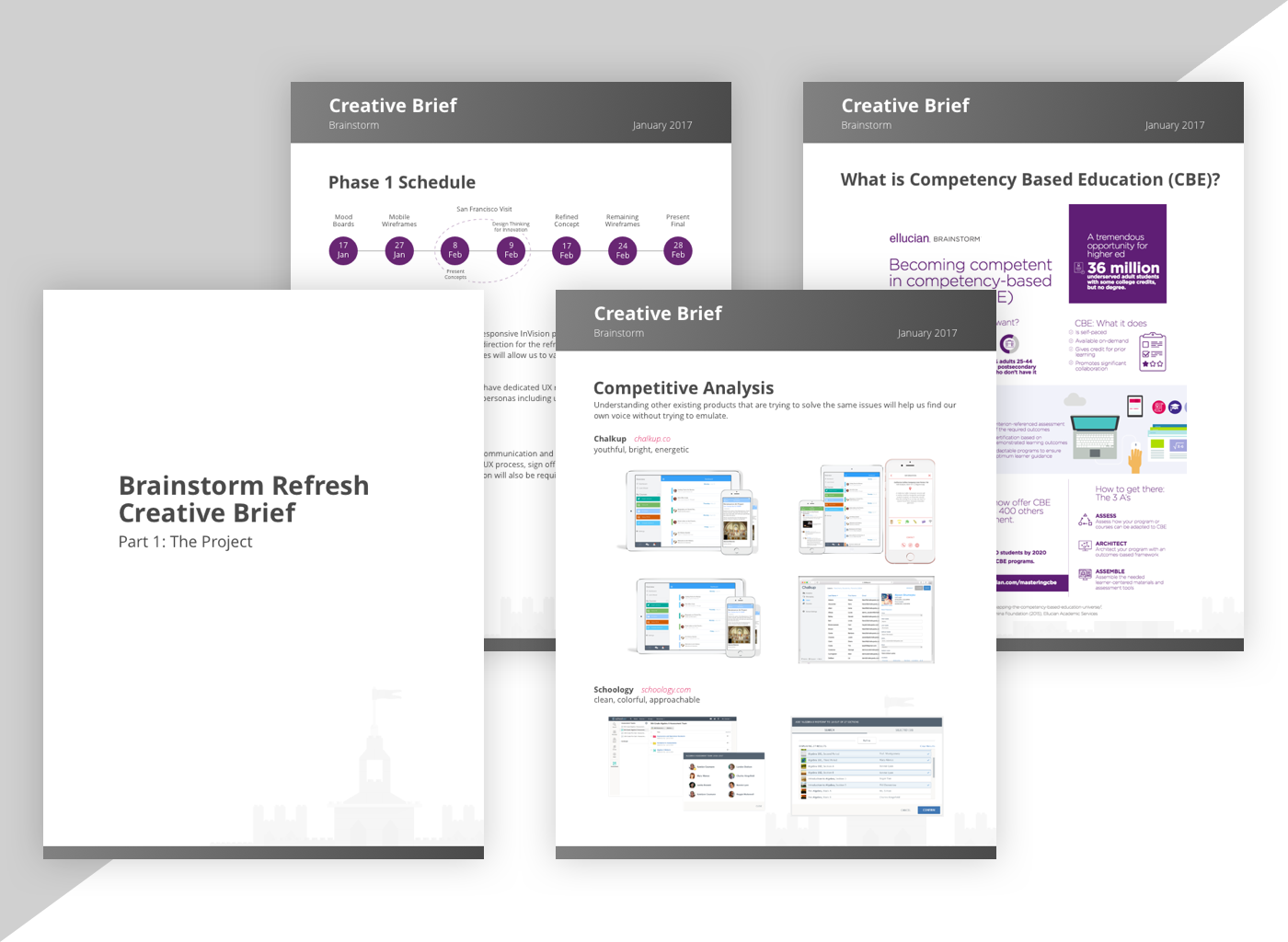
Process
In order to shake up the product, we needed to shake up our process. We took cues from the advertising world and kicked things off with a creative brief. This helped direct our decisions by providing elements like personas, competitive analysis, and overall goals. The creative brief also helped set expectations between the UX team and the product stakeholders.
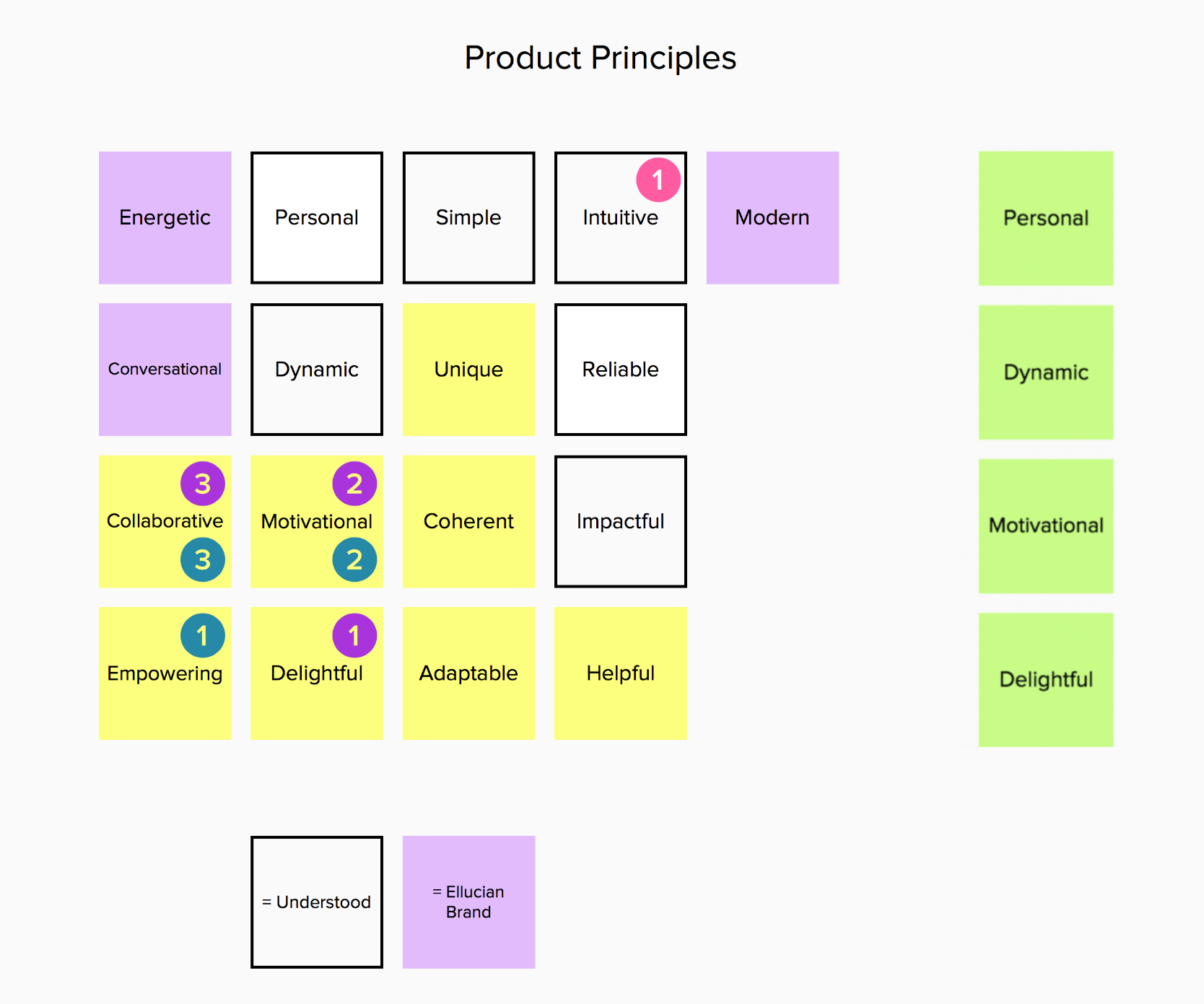
Stakeholder Communication
We made an extra effort to make sure the stakeholder's expectations were met. In order to do this, we wanted to involve them in creating some guiding product principles. This helped marry the product to the overall Ellucian brand as well.
To help achieve this the team came up with some descriptive words and let everyone vote on which ones they felt applied the most. Then we took the top voted words and used them to further direct our decisions.
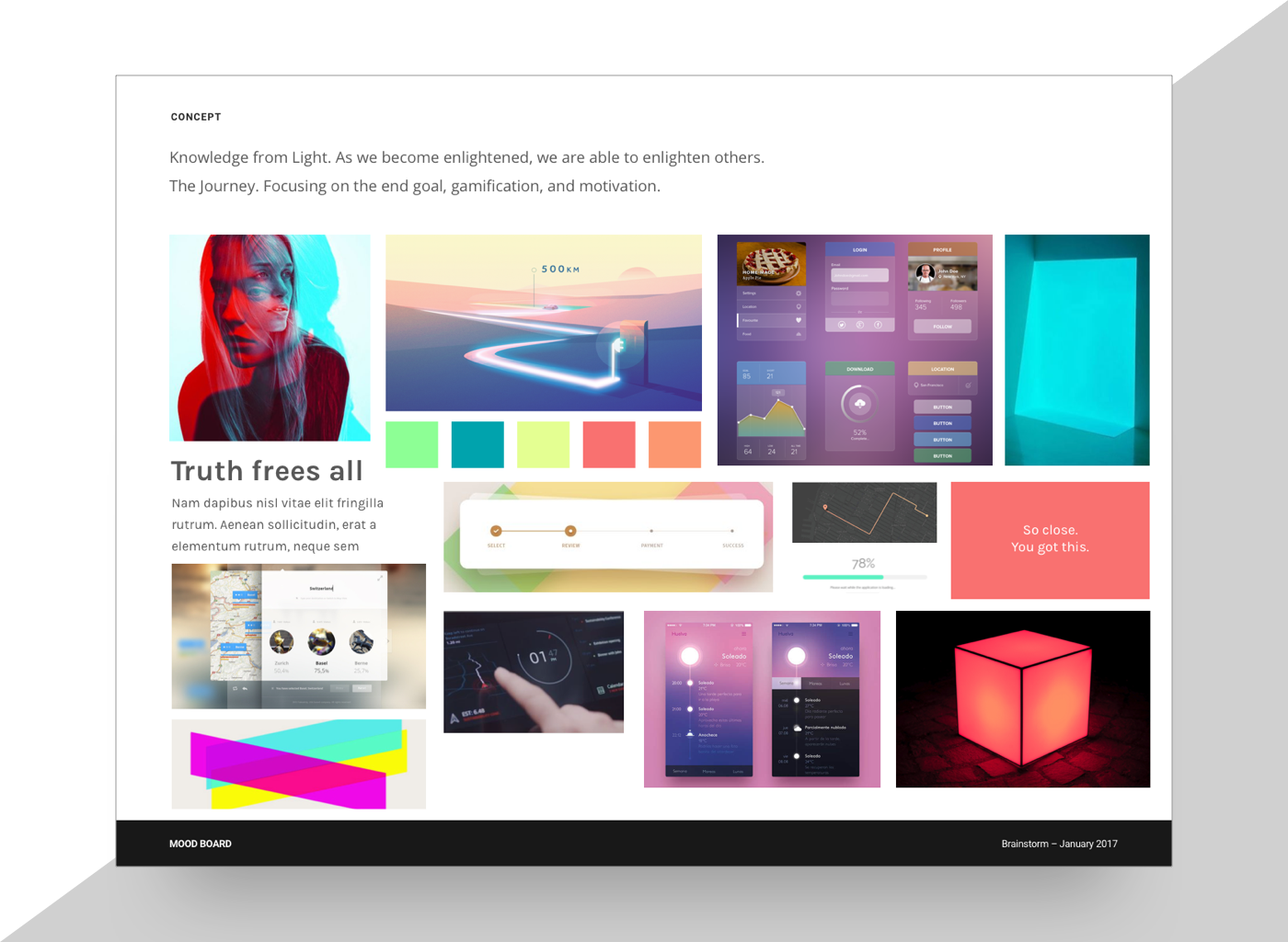
Mood Board
Another way the team strayed from a "traditional" UX process was by developing the overall look and feel through mood boards. Through these, we were able to start with a sprawling concept that could manifest itself in the details.
Wireframes
Once a direction was settled on, we were able to bring these elements into some wireframes to make sure workflows were accurate and needs were met.
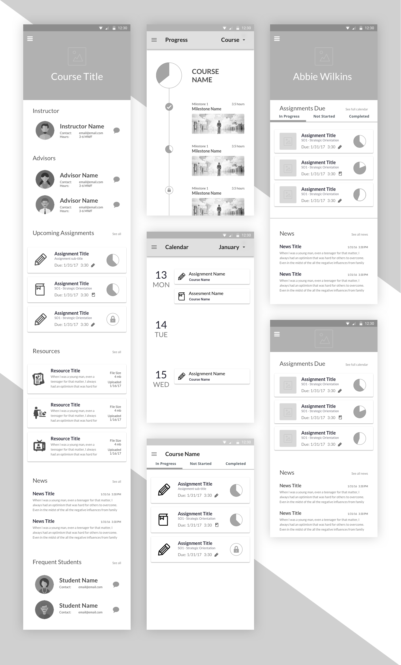
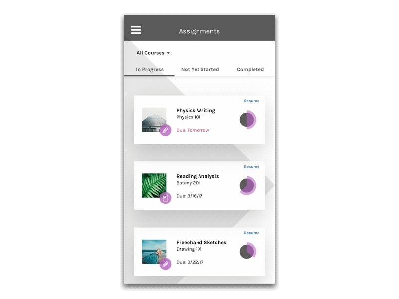
Final Screens
After some great feedback from the stakeholders and within our UX team, the final look and feel was determined.

The idea of a pathway, or journey was abstracted throughout the app.
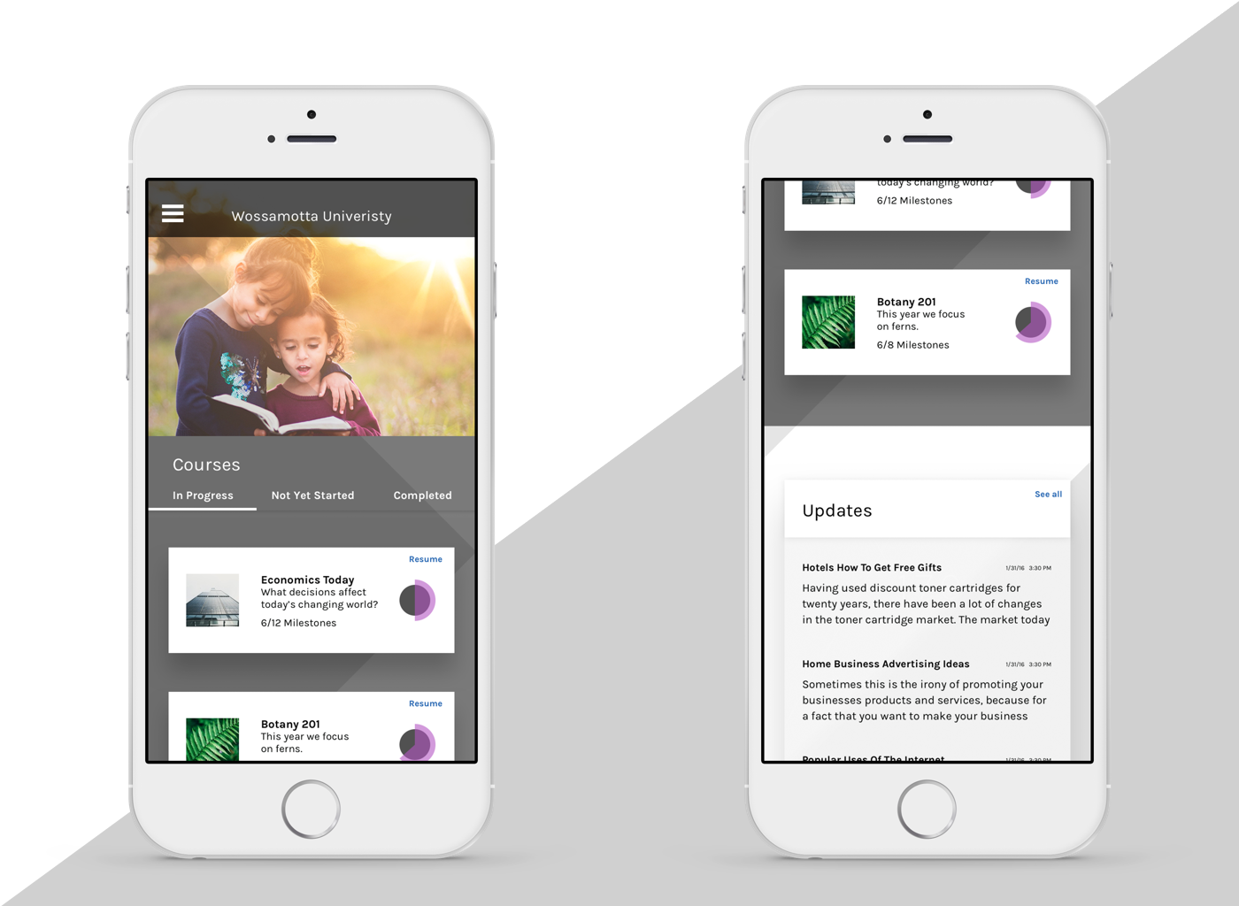
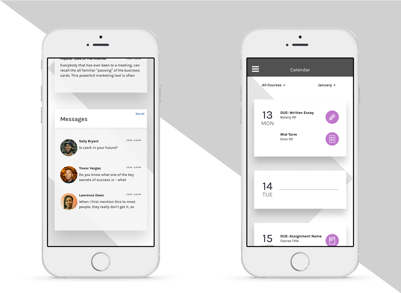
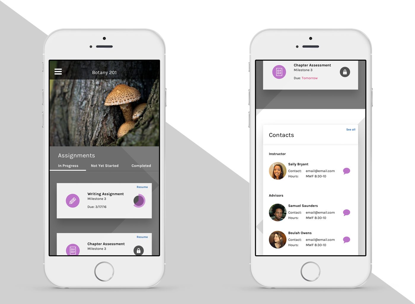
Initial idea of interaction.
Adaptive Branding
This product needed to be adaptable to any school's branding. We chose some of the less attractive school colors to see how it would look.
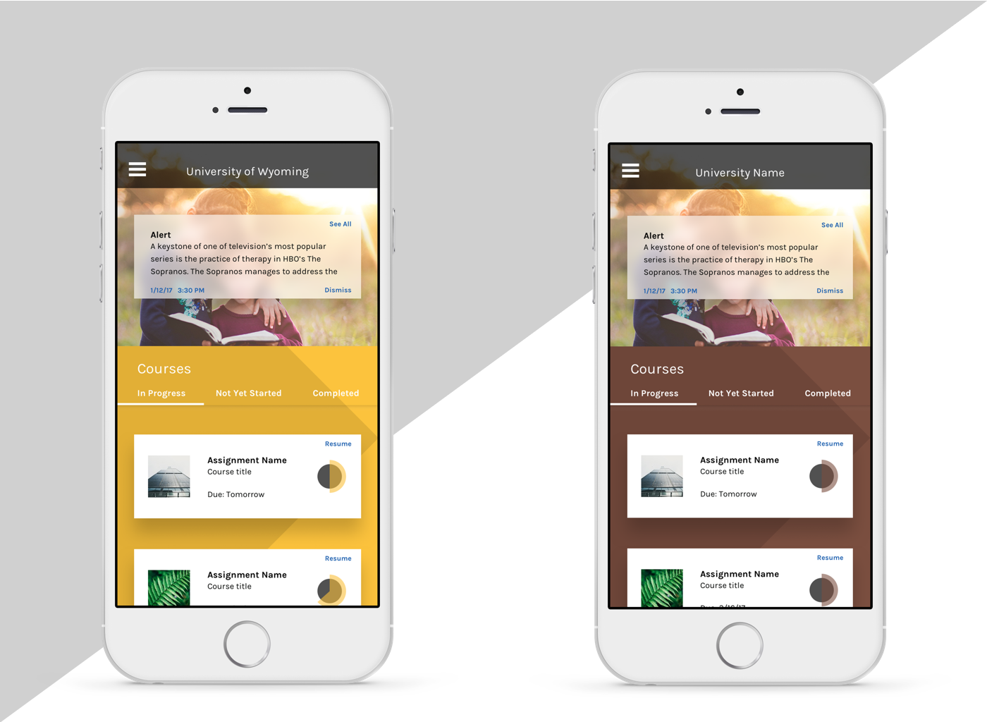
Using the University of Wyoming's colors, we were able to see the worst-case scenario for brand adoption.
UX Debt
Our initial charge was to create mobile screens for a few of the product's pages that would later be adapted to the rest. In order to do this, there would need to be testing and further pattern creation. Unfortunately, this product got axed right before the final presentation.